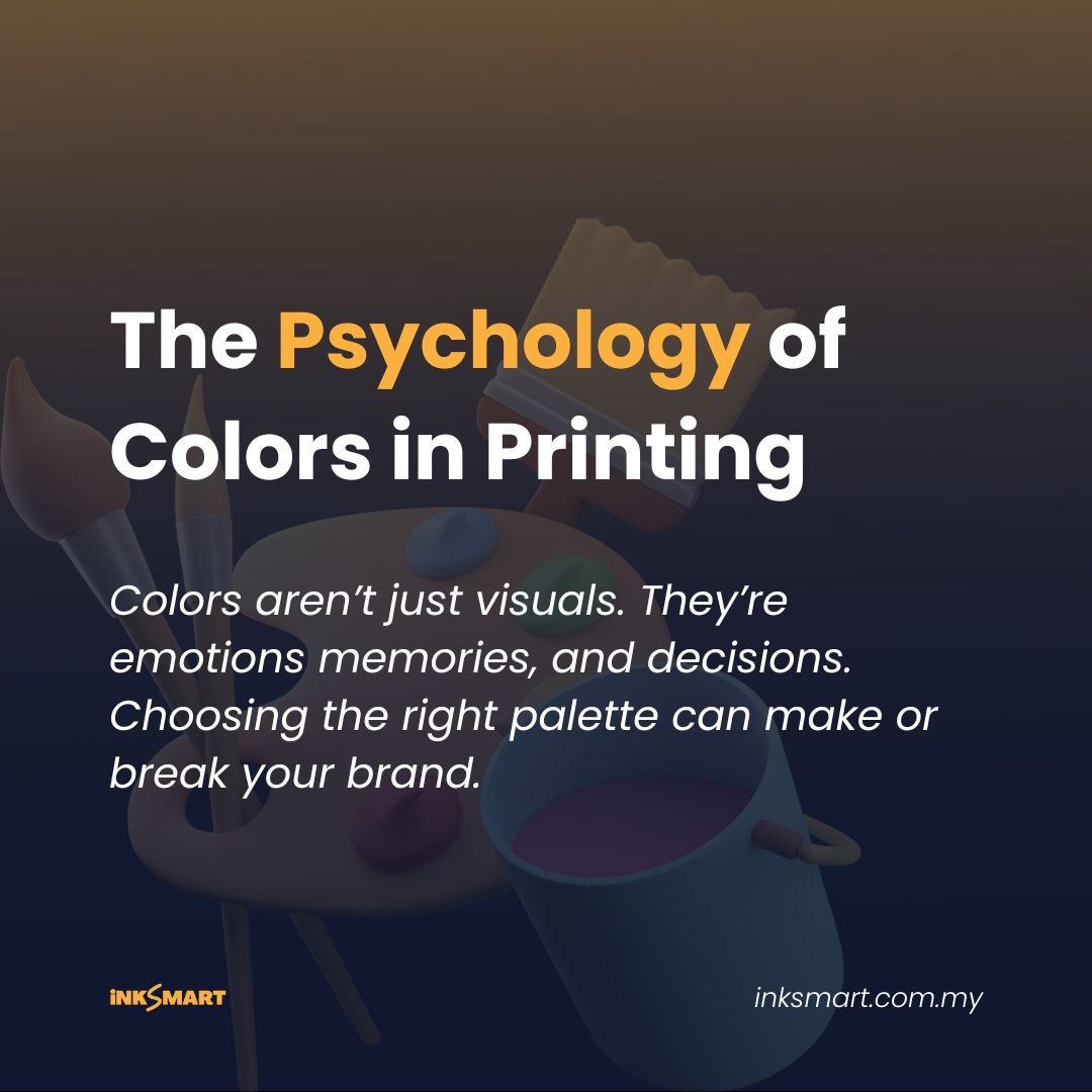
Discover how color psychology in printing shapes trust, memory, and buying decisions. This ultimate 2025 guide shows you how to build a winning brand palette that stays consistent from screen to print.
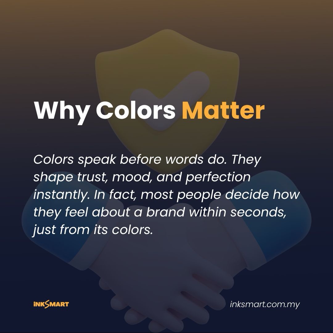
Color is the silent ambassador of your brand. Long before a customer reads a headline or scans a logo, their brain has already reacted to color. In 2025, when brands compete for attention on both screens and printed materials, understanding color psychology in printing isn’t optional but a creative superpower.
Why Color Psychology in Printing Matters More Than Ever
Imagine walking into a bookstore. Two new product catalogs sit side by side. One radiates fresh greens and earth tones; the other bursts with hot reds and oranges. Your brain makes a split-second guess about what each brand stands for. Eco-friendly vs. energetic, before you even read a word.
That instant reaction is color psychology in printing at work. Printed colors leave a tactile memory: a business card’s matte blue finish that whispers trust, or a glossy magenta brochure that shouts excitement. In a world flooded with digital ads, print gives color a physical presence, and that presence shapes brand perception.
The Science Behind Color Psychology in Printing
You don’t need a lab coat to appreciate the science. Colors hit our brains through the visual cortex and trigger emotional and cultural associations. Blue often signals trust and calm. Red sparks urgency and appetite. Green suggests growth and sustainability.
But there’s a twist when you move from screen to print. Digital devices use RGB light, while printing relies on CMYK inks. A neon blue that glows on a phone might look slightly muted on a brochure. That’s why savvy designers never stop at picking “pretty” colors. They translate those colors precisely for printing.
Pantone, CMYK, and the Language of Inks
Think of Pantone as a universal translator for color. While CMYK builds hues by mixing cyan, magenta, yellow, and black inks, Pantone provides standardized spot colors that stay consistent across printers and paper stocks. For a clear breakdown of what to expect when printing with Pantone vs. CMYK colors, check this guide from Noissue.
If your brand identity depends on an exact shade, say a signature coral, specify its Pantone code alongside CMYK and RGB. This is the secret handshake of color psychology in printing, ensuring that your coral stays coral on business cards, packaging, or banners, no matter which printer you use. (see Pantone: Challenge: Variations in Print for how Pantone tightens tolerances across print jobs).
Cultural Nuances: Color Psychology in Printing for a Malaysian Audience
Color meanings aren’t universal. In Malaysia, red celebrates prosperity and luck, making it ideal for festive promotions. White can symbolize purity but also mourning in certain contexts. Gold signals prestige and success, perfect for premium brands.
When you design with color psychology, think beyond your personal taste. Ask: Who will hold this brochure? Which festival or tradition might it connect to? Aligning with local culture makes your palette feel respectful and authentic.
Building a Winning Brand Palette, Step by Step
Let’s roll up your sleeves and create a palette that works in the real world.
Start with a primary brand color that tells your brand’s core story. Maybe a calming teal for a wellness brand or a lively orange for a start-up cafe. Add one or two secondary colors to create constrast and flexibility. These can support call-to-action buttons on flyers or highlight key messages on posters.
As you test combinations, think about hierarchy. A dark background with light text makes a striking banner, while light a base with dark text is perfect for easy-to-read business cards.
Testing Your Palette in Print
Before you print 1,000 brochures, always request a printed proof. What you see on a glossy monitor rarely matches what comes off a press. Coated paper makes colors pop, while uncoated paper softens them. Specialty finishes like matte lamination, spot UV, or foil can deepen or brighten tones.
This isn’t just fussiness; it’s color psychology at work. A soft, uncoated texture might communicate eco-friendliness, while a shiny foil edge screams luxury. Your choices subtly influence how customers feel the moment they touch your material.
Keeping Colors Consistent Year After Year
Consistency is what transforms colors into brand assets. Record every detail, RGB, HEX, CMYK, and Pantone codes in a brand guide. Include notes on paper finishes and printing instructions. Share this guide with every designer, printer, and marketing partner.
Revisit the guide annually. Market evolve, but avoid constant palette changes. Frequent shifts can confuse loyal customers and dilute recognition.
Accessibility and Readability: The Human Side of Color Psychology
A winning palette isn’t only about looks. It also ensures everyone can read your message. High-contrast pairings, like near-black on pastel backgrounds help small text stand out on labels or flyers. For formal guidance on accessible design in print, including contrast ratios and best practices, the Core Principles for Accessible Design in Print document from CharityComms is excellent.
Color should never be the sole way to convey meaning. Combine it with clear typography, icons, or patterns. This approach not only meets accessibility standards but also reinforces your brand personality.
Practical Classroom Tips for Students and Young Designers
Imagine you’re designing a poster for a campus festival. You love a bright cyan headline, but on uncoated paper it may look dull. So what are we going to do? In your local printer, ask for a spot color or choose a Pantone that compensates for ink absorption.
Working on a coffee-shop logo? Think about how that logo will look on a textured cup sleeve, not just your laptop screen. These small checks will save you awkward surprises and they’ll make you look like a pro when dealing with real clients.
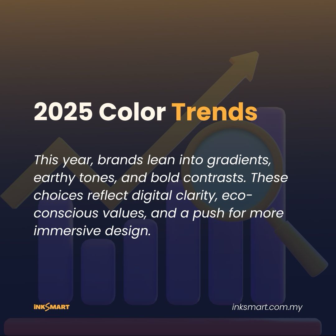
The Future of Color Psychology
2025 is seeing exciting trends: eco-friendly soy inks, digital presses with expanded color gamuts, and augmented-reality print where scanning a brochure unlocks animations. Yet the fundamentals of color psychology remain the same. People still react emotionally to color first.
Whether you’re exploring neon spot inks or biodegradable packaging, the goal is timeless: communicate trust, joy, energy, or calm through deliberate color choices.
Color as Strategy, Not Decoration
By now, you know that color psychology in printing is more than picking shades you like. It’s about strategy. Every hue carries meaning. Every finish adds texture to your brand story.
If you document your palette, test your proofs, and respect cultural and emotional cues, your printed materials will feel like a handshake customers remember. In a crowded 2025 market, that’s the kind of quiet power that builds lasting loyalty.