Table of Contents
Pantone colors in printing are more than just a technical detail. They’re the backbone of professional color management for brands and businesses worldwide. If you have ever wondered why the red of a famous soda can or the blue of a luxury tech brand always looks the same no matter where you see it, Pantone colors in printing are the reason. From business cards and brochures to billboards and packaging, these standardized shades ensure that the color you approve in the design stage is exactly the color that comes out of the press.
In today’s competitive market, where visuals often make the first impression, understanding Pantone colors in printing is essential. This guide explores five powerful reasons why Pantone colors in printing guarantee perfect results, and shows you how to use them to elevate your brand.

1. Pantone Colors in Printing Provide Global Consistency
One of the greatest challenges in the world of design and print production is maintaining color consistency across different devices and printing facilities. Screens display color in RGB (red, green, blue) light, while printers use CMYK (cyan, magenta, yellow, and black) ink. The two systems don’t always match, which can result in a blue that looks brilliant on screen but turns slightly purple or flat when printed.
This is where Pantone colors in printing make a real difference. Each Pantone shade comes with a unique number and ink formula. Printer from Kuala Lumpur to New York can simply look up the Pantone reference and mix the exact ink recipe, ensuring identical results. Whether your project is a magazine ad or a product label, Pantone colors in printing remove all the guesswork.
The Pantone Matching System (PMS) acts like a global color dictionary. Once you specify a Pantone number, every printer, anywhere in the world, speaks the same color language. This means the turquoise on your brand’s coffee cup in Sabah will be the same turquoise on a trade-show banner in Tokyo. That level of precision gives brands confidence that their visual identity will remain intact no matter where or how they print.
2. Pantone Colors in Printing Outperform CMYK for Vibrant and Specialty Shades
Many designers start with CMYK because it’s the standard for full-color printing, but CMYK blends have limits. Some bright, rich, or metallic tones are simply beyond the reach of four-ink mixing. Neon greens, deep royal blues, and shimmering golds are examples of shades that CMYK cannot reproduce faithfully.
Pantone colors in printing solve this problem by using pre-mixed inks. Instead of creating color on the spot by overlapping CMYK dots, a Pantone ink is prepared to an exact formula before it touches the press. This allows for vibrant hues and specialty finishes such as metallic, neon, or pastel that stand out from standard CMYK printing.
For designers who want their work to capture attention with unmatched depth and brilliance, Pantone colors in printing open up a world of creative possibilities. Imagine a luxury box with an exact metallic bronze or a corporate brochure with a signature teal that leaps off the page. So, with Pantone, those striking results are repeatable and reliable.
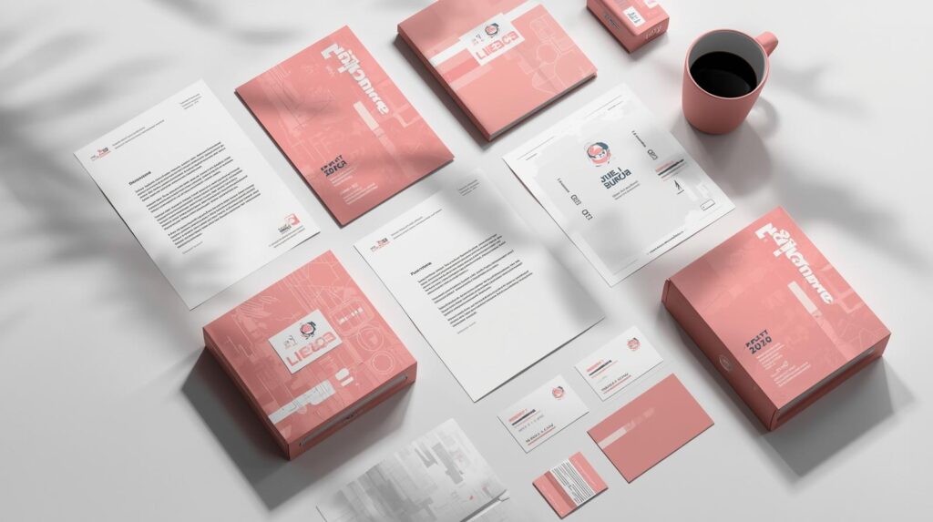
3. Pantone Colors in Printing Strengthen and Protect Brand Identity
A strong brand is more than a logo. It’s an experience built on consistent visuals. Color plays a leading role in that experience. Picture a brand like Coca-Cola suddenly printing cans in slightly different reds across the world. Even a minor shift in hue can dilute brand recognition and trust.
By using Pantone colors in printing, brands can ensure their color identity remains rock-solid. Every Pantone color is a fixed point of reference, so a company’s trademark blue or iconic orange will look exactly the same on every business card, storefront sign, and delivery van.

This consistency builds credibility. When customers see the same Pantone-defined shade every time, they subconsciously associate it with reliability and professionalism. It also provides legal and strategic advantages. For example, many companies specify Pantone colors in their brand guidelines to maintain trademark protection for their visual identity. With Pantone colors, your brand is no longer a suggestion. It has becomes a guarantee.
4. Pantone Colors in Printing Save Time, Reduce Waste, and Cut Costs
Color mistakes can be expensive. A misprinted batch of packaging or a mismatched set of brochures can mean reprints, lost time, and unnecessary costs. Pantone colors in printing minimize these risks by giving printers precise instructions from the start.
When you specify Pantone numbers early in the design process, your printer knows exactly which ink to prepare. There’s no need for endless color tests or adjustments. This not only speeds up production but also reduces ink waste and energy use. For businesses committed to sustainability, Pantone colors in printing are an eco-friendlier choice because fewer resources are consumed in achieving the perfect result.
The financial benefits are significant, too. By avoiding costly reprints and minimizing trial-and-error, Pantone colors protect your budget while delivering premium quality.
5. Pantone Colors in Printing Ensure Print-Ready Accuracy on Every Project
Perhaps the most immediate advantage of Pantone colors is confidence. Before a single sheets rolls off the press, you can request a physical Pantone proof, a small printed sample of your chosen color. Unlike a digital preview, this proof shows exactly how the final ink will look under real-world lighting.
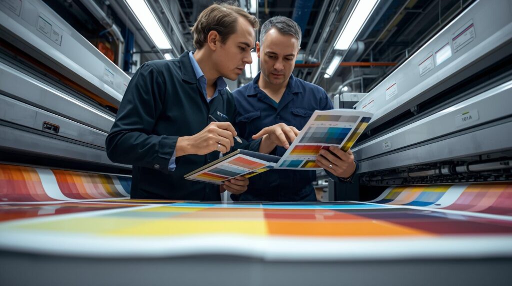
For projects that combine photographs or gradients with solid brand colors, you can even use Pantone alongside CMYK. Logos, headers, or key elements can be printed in Pantone for guaranteed precision, while CMYK handles complex images. This hybrid approach ensures that every part of your design from subtle photo details to bold brand marks will prints exactly as intended.
Practical Steps to Start Using Pantone Colors
If you’re ready to bring Pantone colors into your workflow, start early. Select your Pantone palette at the concept stage, and communicate those exact numbers to your printer and design team. Make Pantone references part of your brand guidelines so that every designer, marketing partner, or external vendor understands the exact color requirements.
Ask for Pantone swatches and proofs rather than relying on screen colors, because every monitor displays hues slightly differently. Once your design is approved, double-check that the Pantone numbers are included in the final production files. These simple habits make sure your investment in Pantone colors delivers its full benefit.
Pantone Colors in Across Different Industries
The impact of Pantone colors reaches far beyond standard marketing collateral. In the fashion industry, designers depend on Pantone textile guides to coordinate fabrics and accessories. In packaging, Pantone inks guarantee that food labels and product boxes remain vibrant on every shelf. Even architecture and interior design use Pantone standards to match paint, wallpaper, and decor to printed promotional materials.
For small businesses and start-ups, this professional consistency can be a game-changer. Whether you’re opening a boutique café or launching an eco-friendly skincare line, Pantone colors instantly give your brand the polish and reliability of global companies.
Why Pantone Colors Are Future-Proof
Trends in design come and go, but brand identity must last. Pantone continually updates its library, adding new shades that reflect cultural moods and technological advances, yet every color remains locked to its unique formula. This means the Pantone colors you choose today will still be reproducible years from now, even as printing technologies evolve.
Whether your brand grows into international markets or remains a beloved local name, Pantone ensures your chosen palette will stay timeless and accurate. That’s long term peace of mind for brand owners and designers alike.
Confident, Consistent, and Compelling Prints Every Time
From the very first line to the final proof, this article has shown how Pantone colors offer unmatched advantages for anyone serious about professional print quality. They bring global consistency, make vibrant and specialty shades possible, strengthen brand identity, cut production costs, and ensure every print is accurate from start to finish.
Color is often the first element people notice, and Pantone colors give you confidence that your brand’s message will shine through in every hue. Whether you’re refreshing a logo, launching a product line, or creating a nationwide advertising campaign, Pantone ensures your vision is reproduced perfectly, every single time.
To explore the official color rules and definitions, you can visit the Pantone Color Systems page for graphic design.