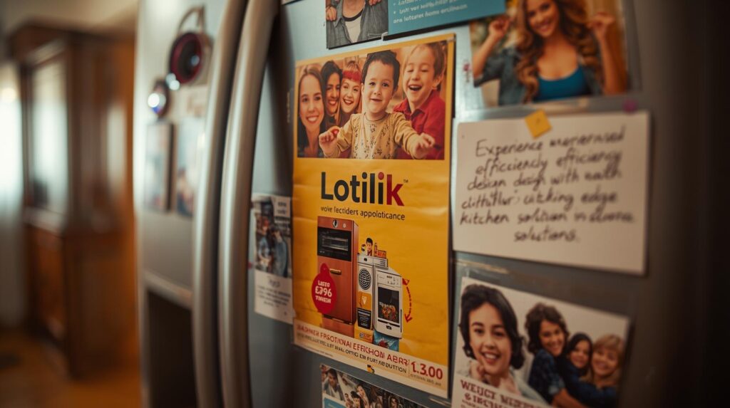
Flyers may seem old-fashioned in today’s digital-first world, but when designed with creativity and strategy, they still work wonders. The challenge is noy just to make a flyer that looks nice but to design flyers that people actually keep. That means creating something so engaging, so valuable, and so visually striking that it doesn’t end up in the nearest trash bin. Instead, it gets pinned on a fridge, shared with friends, or saved for later use.
In this article, we’ll explore flyer design tips that go beyond surface-level aesthetics. You’ll learn how to use psychology, branding, and storytelling to your advantage. By the end, you’ll know exactly how to design flyers that command attention, deliver results, and stay memorable.
Why Flyers Design Still Matters in 2025
With digital ads dominating, you might wonder if flyers still have a place. The truth is, flyers are one of the most cost-effective marketing tools available, especially for local businesses. A well-designed flyer cuts through digital noise and creates a tangible connection with your audience. Unlike an Instagram post that disappears in seconds, a flyer physically sit in someone’s hand, office desk, home.
Why people keep your flyer, it transforms from a promotional material into a mini billboard they see again and again. That repetition builds trust and familiarity, the two crucial elements of marketing success.
Flyer Design Tips #1: Start with a Purpose
Before diving into visuals, clarify the purpose of your flyer. Is it to promote a product launch, announce an event, or spread awareness? Flyers without a clear objective often look cluttered and confusing. If you want people to keep your flyer, they need to know instantly what value it provides them.
Think of your flyer as a focused story. Every design choice, from the headline to the images should support the main goal. When the purpose is sharp, the design feels intentional, and your audience is more likely to engage.
Flyer Design Tips #2: Create a Headline That Hooks
The headline is your flyer’s first impression. People scan quickly, and if the headline doesn’t grab them, they won’t read the rest. A powerful headline can mean the difference between a flyer that’s tossed away and one that gets notice.
For example, instead of writing “Grand Opening of a Café”, say “Free Coffee This Weekend at Our New Café!” See the difference? The second headline communicates urgency, benefit, and excitement. Headlines that offer value and evoke curiosity are much more likely to make our flyer memorable.
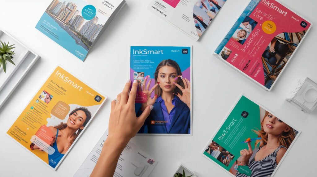
Flyer Design Tips #2: Use High-Impact Visuals
Flyers are visual by nature, and the wrong image can kill engagement. Stock images that look generic often get ignored. Instead, use high-quality photography or custom illustrations that align with your brand. People keep flyers that feel unique and visually appealing.
If you’re designing for a restaurant, include mouth-watering photos of your best dishes. For a fitness class, use dynamic shots of real people training. Authentic visuals create trust, while striking imagery makes your flyer stand out from the pile. When learning how to design flyers that people actually keep, visuals matter more than words. If you want more inspiration, check out Canva’s flyer design guide for practical examples.
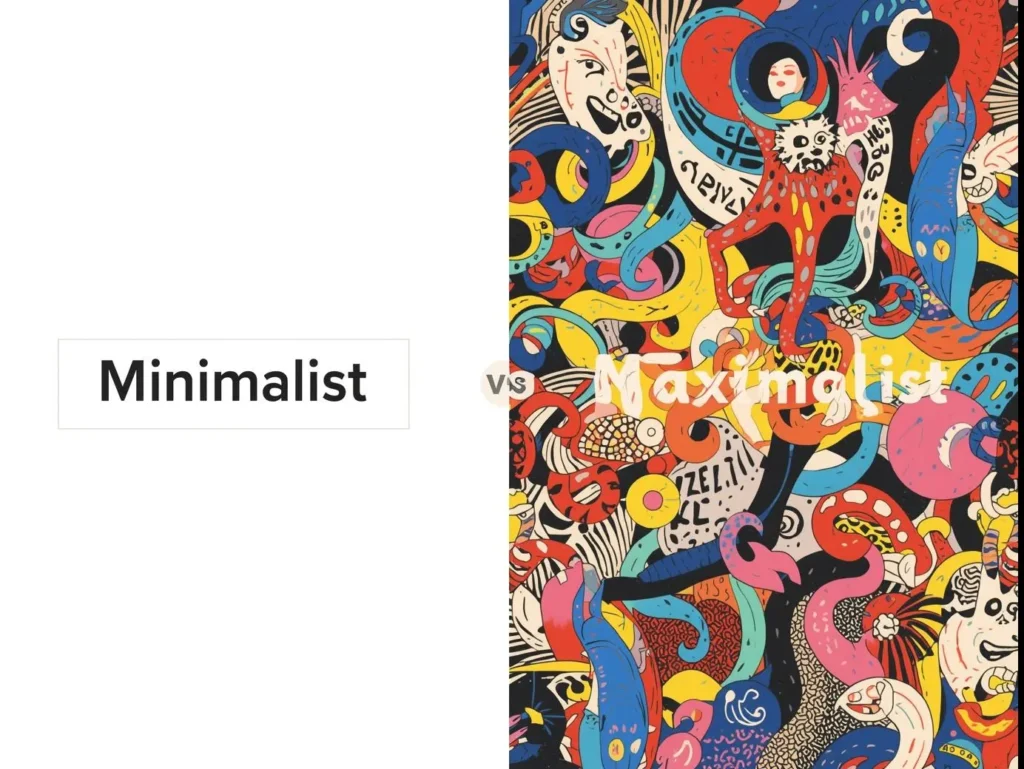
Flyer Design Tips #4: Keep the Layout Clean and Focused
A common mistake in flyer design is cramming too much information onto one page. When people feel overwhelmed, they disengage. Instead, design with clarity and white space. Clean layouts allow the main message to shine.
Use hierarchy in your typography: bold headlines, readable subheadings, and concise body text. Guide the reader’s eye naturally from top to bottom. A flyer that feels easy to read is far more likely to be kept.
Flyer Design Tips #5: Tap Into Color Psychology
Colors influence emotions and decisions. When designing flyers that people actually keep, choose a color palette that matches your brand identity but also sparks the right emotional response. Colors shape emotions and decisions more than we realize. For a deeper dive into this, 99designs explains color psychology in branding with real-world examples.”
For example, red grabs attention and conveys urgency, perfect for limited-time offers. Blue inspires trust, making it ideal for professional services. Yellow feels cheerful and inviting, great for family events. By aligning colors with your flyer’s purpose, you create a stronger connection with your audience.
Flyer Design Tips #6: Add Value Beyond Promotion
Why do people keep certain flyers? Often, it’s because they provide value. Flyers with discount coupons, QR codes linking to exclusive content, or event calendars get saved because they’re useful.
Consider adding a “tear-off” section with a promo code, a checklist, or even a mini calendar. If your flyer provides ongoing value, it will stay in people’s hands longer, reinforcing you brand message every time they see it.
Flyer Design Tips #7: Focus on Readability
Even the most beautiful flyer won’t work if people can’t read it. Typography plays a huge role here. Stick to 2-3 at most, and make sure body text is legible at arm’s length. Avoid overly fancy fonts that sacrifice readability for style.
Contrast is key. Dark text on a light background or vice versa ensures your content stands out. Remember, flyers are often read in a variety of environments, from dim cafes to bright outdoor spaces. Good readability ensures your message always lands.
Flyer Design Tips #8: Use Storytelling to Connect Emotionally
Flyers are more than information. They’re an opportunity to tell a story. Stories trigger emotions, and emotions drive action. Instead of listing dry facts about your business, frame your flyer as a journey.
For example, a charity flyer might highlight a personal story of someone who benefitted from donations. A cafe flyer might share the founder’s passion for coffee. Storytelling transforms your flyer from disposable paper into something people feel emotionally attached to.
Flyer Design Tips #9: Make Your Call-to-Action Irresistible
Every flyer needs a call-to-action (CTA), but not just any CTA. It has to be compelling. “Visit our website” is forgettable. “Claim your free trial today” is unforgettable. A strong CTA gives people a reason to take action now, not later.
Placement matters too. The CTA should stand out visually, whether through bold color, larger font, or a distinct box. When the action step is crystal clear, people are more likely to engage and remember your flyer.
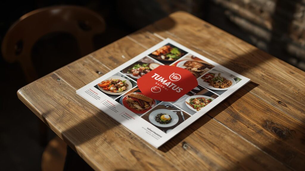
Flyer Design Tips #10: Print Quality Matters More Than You Think
The feel of a flyer in someone’s hand is just as important as its look. Thin, flimsy paper communicates cheapness and makes it more likely your flyer will be tossed. In contrast, thicker stock, textured finishes, or glossy coatings instantly elevate your flyer.
Premium finishes make your flyer feel like something worth keeping. After all, people associate the quality of your print materials with the quality of your brand. Invest in good printing, and your flyers will carry more weight, literally and figuratively.
Bonus Flyer Design Tip: Add a Digital Touch
We live in a hybrid world where print and digital complement each other. Adding a QR code that links to a video, landing page, or special offer bridges the gap between offline and online. This not only increases engagement but also provides you with valuable data on flyer performance.
When people can scan your flyer to access more content, it becomes interactive, relevant, and harder to throw away.
Final Thoughts: Designing Flyers That People Actually Keep
Flyers aren’t just about spreading information. They’re about creating an experience that people want to keep. By applying these flyer design tips, you can transform simple paper into a lasting marketing tool.
Think of every flyer you create as an ambassador of your brand. When designed with purpose, value, and creativity, your flyer doesn’t just advertise. It builds relationships. People keep what feels useful, beautiful, and meaningful.
So, the next time you sit down to design, remember: clarity, storytelling, and quality turn ordinary flyers into unforgettable ones and when your flyer makes it to the fridge door instead of the trash, that’s when you know you’ve succeeded.